An author website should be your #1 priority when setting up an online author platform. A website is where you direct fans and followers from your social networks, where you send your email subscribers once they open your email and where you direct media and bloggers to find resources to review your book.
An author website should include everything someone needs to find out more information about you, your book and how to buy your book. It should also include everything the media needs to write about your book, how to contact you and other places to find you online.
Here are 4 great non-fiction book websites that are doing things right. (These are also books that we highly recommend.)
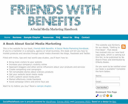
Friends With Benefits by Darren Barefoot and Julie Szabo
www.friendswithbenefitsbook.com
What works:
- The bullet points on the homepage make it clear what’s covered in the book.
- Visitors can sign up to get notified about when book is available. (Although, now that the book is published, this should be taken down).
- Visitors can download a sample chapter to see if they like the book.
- There’s a resources page for reviewers that includes a way to contact the authors to get a copy of the ebook to review, image (with HTML code) of cover and of the authors, as well as a YouTube video. Online media, in particular bloggers, like to use visuals in their articles. Both the image HTML code and YouTube embed code make it easier to share.
- There’s a FAQ page that outlines who should buy book.
- The contact page provides a way to contact the authors both by phone and through an online form.
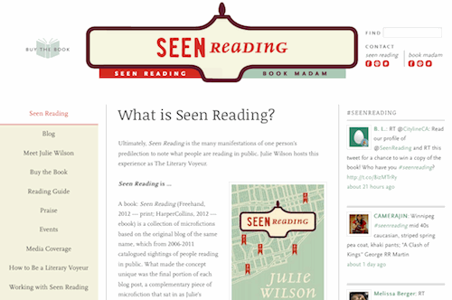
Seen Reading by Julie Wilson
What works:
- A Twitter feed is being pulled into the site, which adds fresh content to the homepage.
- The Meet the Author page includes a downloadable author photo and book cover image for media to use, as well as a short and long bio.
- There’s a link to buy the book in the top navigation and the side navigation. The buy links take you to a page with multiple ways to buy the book, depending on your preference.
- The downloadable reading guide gives readers another way to explore the book.
- The reviews and links to media coverage provide social proof by telling visitors how well the book has been received.
- There is a list of the author’s speaking events.
- How to Be a Literary Voyeur encourages fan participation, which is important for word of mouth and social sharing.
- Working with Seen Reading is a great prompt that explains how the author can work with festivals, booksellers, book clubs, libraries and journalists.
- Plus, there’s lots of ways to contact the author and stay in touch, both on the contact page and in the top site navigation.
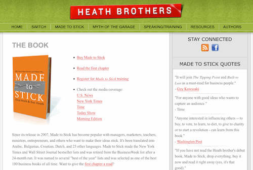
Made To Stick by Chip and Dan Heath
www.heathbrothers.com/madetostick
What works:
- The first bullet on the landing page is a link to buy the book.
- The buy page has links to a variety of stores. Again, this lets buyers choose where they want to purchase from based on personal preference.
- There’s a link to read the first chapter.
- There are links to read the media coverage of the book.
- There’s a compelling explanation about the book that helps to answer “why should I buy this?” (We highly recommend this!)
- Review quotes are clearly visible in the right sidebar, as are the book’s awards.
- Their newest book Switch, along with their other published titles are available on the same site with the same great content as noted above.
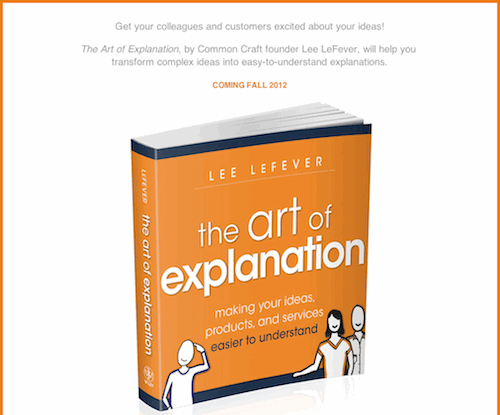
The Art of Explanation by Lee Lefever
What works:
- While the book isn’t published yet, the authors have put up a landing page for the book, which is a great way to promote the book and start gaining website traffic (we’d also add social sharing buttons so that people are encouraged to +1, Tweet or Share on other networks like Facebook).
- The top of the page states the book’s hook or promise.
- It is clear when the book is available.
- The giant image of the book cover is compelling.
- There’s an email subscribe form to stay informed about the book.
- There’s an author bio, publicity contact information and links to follow on Twitter and FB. It’s a good starter page.
Wondering what to include on your author website? Here’s a checklist.
10 Things to Include on Your Author Website
- Links to buy your book. People have different buying preferences so, if you aren’t selling the book on your website then provide links to multiple places where readers can purchase your book.
- Information on how to get a review copy.
- A media resources page with author and cover image photos as well as a bio for media to use when writing about or reviewing your book. Include a YouTube video if you can.
- Details on how to contact you and the best way to work with you and/or hire you for speaking events.
- Compelling copy that answers who should buy your book and why. This can be in the form of a description, FAQ, review quotes, and/or links to reviews.
- A sample chapter.
- Ways to stay in touch with you, for example an email subscribe form and links to Twitter, Facebook, Goodreads, and anywhere else where you’re online.
- List of speaking events.
- Links to any other resources that you have for your book—reading guides, background materials, etc.
- Sharing links so that people can easily +1 or share via Twitter, Facebook and other social networks.
Are you an author looking for more tips? Read our post on Online Marketing for Authors.
Also check out: How to Use Analytics to Optimize Your Website.

