Want to increase your online sales? This post looks at what editors, marketers and copywriters can do to improve sales conversions by optimizing landing pages — all without design or code help.
Landing page optimization is hard. At least that is a common complaint from publishers. The challenge for many with landing page optimization is that website design changes involve programmers who don’t have the time or outside agencies who charge too much for a small change. Below are 3 simple landing page optimization tips for book detail pages that don’t involve design or IT, plus landing page examples.
#1 Small Changes to Copy Can Have a Big Impact on Sales
Landing page optimization is about improving the percentage of visitors to your website who become sales leads or buyers. Small changes to copy on landing pages, in particular book detail pages, can have a big impact on sales conversions.
If you have design/coding assistance, then start with the most prominent text, usually the title and subtitle. Consider whether the font size and colour are helping or hindering sales conversions. Do the font and colour increase readability and reduce any mental strain for visitors who want to quickly establish if they are on the right page?
Landing page examples: Random House Canada vs. University of Toronto Press
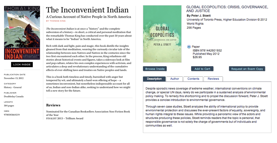
I’ve purposely cropped the pages in order to focus only on the body section so we can more easily compare just the copy.
- The font size and colour for the title and subtitle work well for The Inconvenient Indian.
- Copy Format Recommendations for Global Ecopolitics: Title Case vs. All Caps is often easier to read, and font colour black and bold vs blue would make the title pop more. These are low-level code changes that should be easy to make.
Right. But I did say this was about small, non-technical changes so what other elements can be tweaked?
Well, people see the most prominent text first. If you squint at the screen, note the areas of the page that pop out and the order in which you notice them.
The page design will affect this, but typically it’s the first words of the first paragraph and then the first bullet point or indentation of text that draw the eye.
Landing page examples: Heatmaps show that visitors typically view content in an F-shape pattern. The first paragraph and first sentence of the second paragraph are key to grabbing attention.
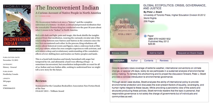
Copy changes to test:
- With The Inconvenient Indian you can see that the eyeflow moves from the title-subtitle-author to the first paragraph, then down to the bolded Reviews text. I’d strengthen the copy in the first paragraph by adding an easily digestible one-liner about the book. Perhaps part of the Globe and Mail quote: “Essential reading for everyone who cares about Canada and who seeks to understand native people, their issues and their dreams.” For the first sentence of the second paragraph, I’d call out a distinctive aspect of this book, like “Thomas King, master of the lethal one-liner, refashions old stories about historical events and figures …” Then under Reviews, consider making the awards into a bulleted list to improve the readability.
- For Global Ecopolitics: The white space under the title, rights info and page count traps the eye there instead of creating flow down to the book description. If you can only adjust the copy, I’d add a sales handle in bold as the first sentence of the description to pull the eye down the page to the copy.
As you can see with certain page designs, eye flow is not to the first paragraph of the description. In those cases, I recommend considering how you can use text formatting to direct visitors to the book description.
There are several heatmap tools that are easy to install, like CrazyEgg.com, which are a great tools for visualizing what areas of landing pages are being viewed and clicked.
When changing landing page copy, think about your prospective buyers. The questions they might have in their head include “what is this book about? Is it of interest to me? Is the book worth paying for? How do I get this book?”
Landing page copy should peak visitors interest in the first paragraph then address a common pain point in the first bullet or reinforce a distinctive aspect of the book.
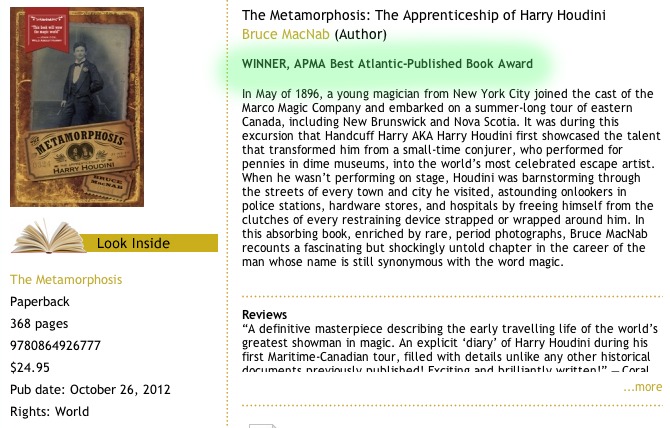
- Fiction: Is this any good? Is it worth my time and money? Gooselane uses an award to reinforce this.
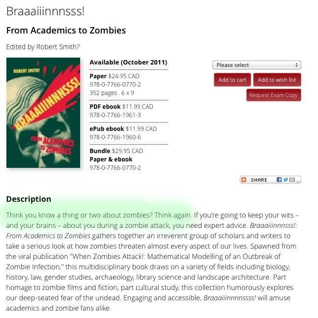
- Nonfiction: Is there new info here? Is it worth my time and money? University of Ottawa Press uses a question to draw attention to the content.
Book Description Tips:
- Bolded, one-liners and sales handles reinforce the value of the book. Put them up front.
- Short, first sentences are easy to read. Even better if you make them enticing.
- Think about the 3 keyword phrases or talking points that you want people to immediately understand about the book or author. Structure the text so that those snippets standout.
Publishers are incredibly strategic when it comes to cover designs. Applying the same practice to the copy will result in rich, results-oriented landing pages that are optimized for sales conversions.
Speaking of strategy, this leads us to the next two landing page optimization tips.
#2 Use Review Quotes Strategically Since They Act as Testimonials & Social Proof
Location, location, location.
Publishers typically clump review quotes at the bottom of the book page in a seemingly random order. Instead, a basic landing page optimization tip is to place 1 or 2 of those testimonials higher up on the page.
Landing page example: Harper Collins‘ book detail pages are representative of most publisher book detail pages. The reviews, which reinforce the sale, are often too far down the page to provide value.
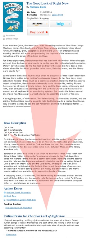
The source of the review quote is often secondary to the content of the quote when it comes to optimizing for the sales conversions. For the higher-placement quotes, find testimonials that reinforce the value of the book or address any common pain points (is this worth buying, is it worth my time, will it solve a problem for me: I’m bored, I need info).
Recommendations for using review quotes:
- Move 1-2 review quotes to the top of the description
- Use text formating to bold key pieces of sales info. Or find other ways to help those snippets stand out.
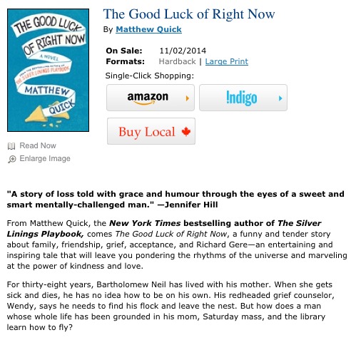
Other Tips for Using Review Quotes Strategically:
- For first-time authors, make the first review quote following the author bio one that addresses the author’s writing style, offers comparative examples or helps differentiate the author.
- And, if you can, place a short, positive testimonial near the call to action button that serves to nudge visitors towards the purchase. Star reviews work too.
Landing page example: Tightrope Books uses a bolded, establishing statement near the call to action. Amazon book pages do this very effectively by placing star reveiws next to the price.
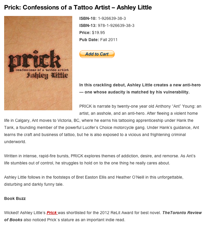
Recommendation on Buy Buttons: Instead of using the standard PayPal button, upload a unique button design to PayPal when generating the Add to Cart code.
#3 Effective Call to Action Buttons Are Critical
The visibility and hierarchy of call to action buttons have a direct impact on sales conversions. In this case you may need to involve designers or programmers in order to create a clear, single call to action.
Landing page example: House of Anansi has an easy to digest layout for book detail pages but the possible actions—preview on Google, add to shopping bag, add to wish list—lack the heirarchy that drives the eye to the most important revenue action, which is buy the book.
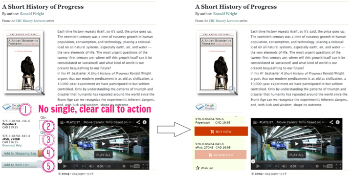
Call to Action Recommendation: Create a visual heirarchy by changing up the button styles, which can reduce the perceived amount of text and mental overhead needed to figure out how to buy the book. FG Press uses a prominent button for the main Buy button, a fade on the secondary action and a teritary style for other buying and sharing options.
There are lots of excuses for not addressing problems with call to action buttons. “If people want my stuff, the button doesn’t really matter.” Hahahahaha. No click = No sale.
If you cannot change the button location or design, consider the button text:
- Make sure you use verbs for the button text. And test the text to discover the best action words. For example, a micro verb might nudge a prospect better than a macro verb. i.e., Buy Now vs. Purchase Book. Simplying the text can have a big impact: Buy vs. Order, or Get vs. Download.
- Use conventions. Add to Cart vs. Add to Shopping Bag
If you offer bundles or multiple formats, and have design/coding help, then explore the cues used by software websites to upsell or nudge buyers towards the more profitable offerings.
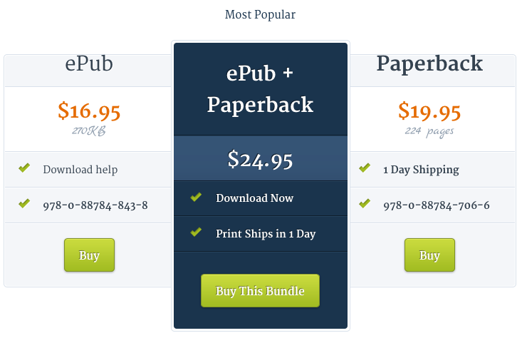
When it comes to landing pages, whether you want visitors to download an excerpt, fill out a contest ballot, buy the book, or click to read more, these clicks have a measurable impact on sales conversions and should be tested. If you want to gather actionable insights into visitor behaviour then Optimizely is another great tool for A/B testing and landing page optimization tips.
Optimizing landing pages does not have to be about changing the page design. To improve sales conversions, it’s more important to optimize for the aspects directly related to decision making: Copy, Testimonials & Calls to Action
 Click to Tweet: Landing page optimization is not rewiring the building, it’s changing the bulb so the light is more flattering. http://ctt.ec/B8emE+


