Running conversion campaigns without campaign-specific landing pages? Your regular webpage may convert at 2-3% but an effective landing page converts at 10-15%
landing page, landing page examples, what are landing pages, landing page design,

What is a landing page?
A landing page is a page on your site that is designed to convert leads. There are two types of landing pages: organic landing pages and campaign-specific landing pages.
- Organic landing pages are the first page viewed in a session. In Google Analytics, the Behaviour > Landing Page report shows the landing pages (or first entry points) to your website.
- Campaign landing pages are single-focused and designed to present an offer in exchange for something (money, an email address). The difference between a campaign landing page and an organic landing page is that traffic lands on a campaign-specific landing page often because of an ad. Campaign-specific landing pages are often not indexed in seach. These campaign landing pages are not meant to be searchable.
Landing pages are part of the inbound marketing ecosystem. Marketers often use landing page builders—like Unbounce, Instapage, Mailchimp—because these tools are useful for building, launching, and optimizing landing pages without the need for developers or special integrations or updates to your web platform.
Why does your ad campaign need a campaign-specific landing page?
Simple. Different landing pages are needed for different audiences with different intent who need different messaging.
Traffic to organic (general purpose) landing pages typically comes from owned and earned media (search engines, company email newsletters, branded apps, referrals). Traffic to campaign-specific landing pages typically comes from paid media (ads, sponsorship, paid-influencers).
Can you see the difference between these examples of landing page design?
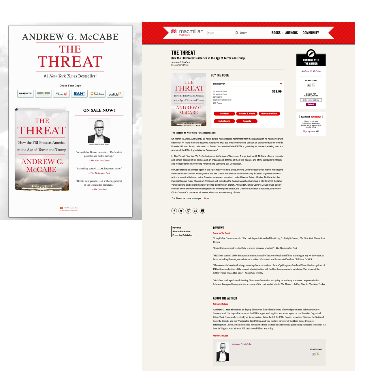
Below is a campaign landing page (left) and a general purpose landing page (right), in this case a book detail page.
The book detail page (right) is about awareness and engagement. The landing page design for a book has to be general purpose. Lots of organic traffic comes to this page. There are many ways for visitors to arrive on this landing page. There are lots of reasons why visitors are here. A good conversion rate for a general-purpose landing page is 2-3% whereas it is 10-15% for an effective campaign-specific landing page.
The Treat. This is an explosive book!
The campaign landing page design uses a larger font size for the H1 heading. The main call to action — order your copy — is upfront. And the landing page template shows a large product image and social proof in the form of media review quotes. The campaign landing page is conversion optimized. Buy. And the copy reinforces that this is a #1 New York Times Bestseller.

Every ad campaign needs a campaign landing page. A common mistake is running ad campaigns to a general book detail pages vs. a persuasive landing page. This is a waste of money.
Your typical book detail page is cluttered with information. It’s like the homepage for the book, meaning that it’s trying to do something for everyone: read an excerpt, learn more about the author, see related titles, follow us on facebook, add a review … oh right, buy the book.
The general purpose book detail page (above on the right) is busy. The landing page template uses a beige background, which makes the book cover look muddy vs. popping off the page. There’s a lot happening on the book detail page, making it harder to immediately see what is this, who is it for, what’s noteworthy. The retailer links are all in red and given equal weight. The visitor has to read the text to find their preferred retailer vs. clicking the logos on the campaign landing page. The book detail page is text heavy. This slows the visitor down. It makes them reflective.
The book detail page loses momentum whereas the landing page design for the campaign has some immediacy or urgency to it, along with a singular focus: buy.
Effective campaign landing page templates
The purpose of most publisher ad campaigns is to drive conversions. Buy the Book. You are spending money to make money. You want people to buy the book. Remember, a good conversion rate for a regular webpage is 2-3% whereas it is 10-15% for an effective landing page. Stack the deck in your favour! Use a proper landing page for your ad campaigns.
A landing page is a campaign-specific webpage that is created to convince visitors to take action: buy now. A campaign landing page is single-focused, in that there is a single, clear call to action. Visitors are not distracted by elements like main-site navigation or multiple calls to action, like search, see related products, or social media follow/share links.
And yes, for non-ecommerce sites, you should still use a dedicated landing page for your ad campaigns.
Not enough publishers make good use of landing pages. Sending inbound traffic from an ad campaign to a book detail page is like telling a customer in your store that the book they are asking for is down aisle 4. You’re leaving the customer up to their own devices vs. helping them complete the task. Please re-read Steve Krug’s Don’t Make Me Think.
An effective campaign landing page will have:
- A great headline
- Copy that states the offer and its value, plus supports the decision process with trust signals and/or social proof
- A form and call-to-action button for the main CTA (call to action)
- A secondary CTA, such as join a mailing list, get alerts, follow us on social. Note: These secondary actions are about capturing leads who are not quite ready to take the main offer. The secondary action should not distract the visitor from the primary call to action.
Here’s an example of a good ad campaign with a dedicated landing page.
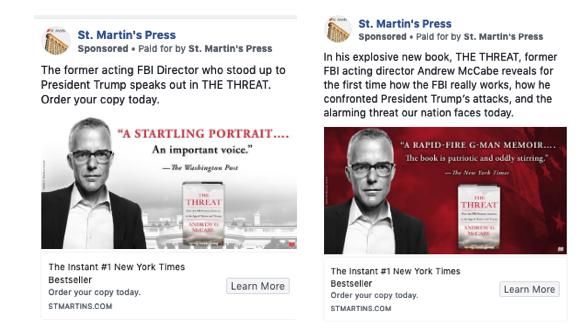
St. Martin’s Press ran Facebook Ads for The Threat by former acting FBI Director Andrew G. McCabe. They A/B tested different ad options: red vs. white image, New York Times quote vs. Washington Post quote, different descriptive text, etc.

Clicking “Learn More” led visitors to a dedicated campaign landing page (see below).
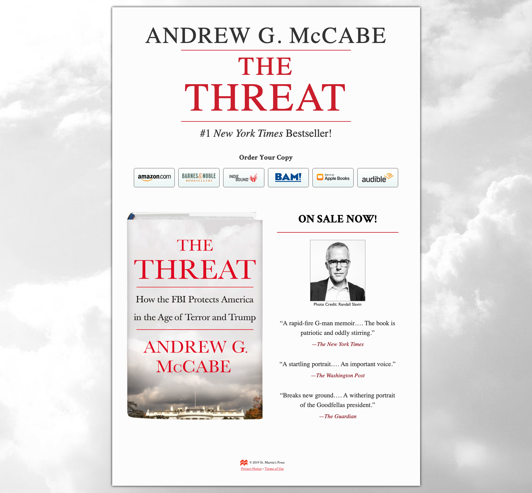
What I like: The headline style mimics the book cover. The text is big and bold, easy to read. The book is a 3D image that provides the viewer a sense of the size and feel of the book. Looks like hardcover, 200-300 pages. St. Martin’s Press does not sell direct to consumer so they have big clickable buttons to retailers. Big thumb targets are necessary for call to action buttons, no tiny text. Most social media use is via a smartphone, which means people clicking the ad will be on their phone. The landing page is mobile optimized. The media quotes offer social proof that this book is worth reading.
What could be improved: Aim for a consistent call to action. The page has “Order Your Copy” and later “ON SALE NOW!” Order your copy sounds like pre-order. I’d be more overt and say “Click to Buy Now”. The quotes are good, but I’d still offer a 1-line description of the book, “The former acting FBI Director who stood up to President Trump speaks out.”
Want to create landing pages for your ad campaigns? There are a few options.
1. Do it yourself. Create a static webpage in your content management system and drive ad traffic to that page vs. the book detail page.
2. WordPress has several options for landing page plugins that are easy to use and install.
3. Mailchimp has a landing page template builder, and you can easily integrate your Google Analytics tracking and Facebook pixel for tracking. If you’re already using Mailchimp for email newsletters then this is a great drag-and-drop option. The templates are pretty standard and you don’t have a lot of flexibility but they are certainly more effective than driving ad traffic to a book detail page.
4. The best landing page builder, with a ton of flexibility, is Unbounce. Here’s my Unbounce affiliate link, which gets you an exclusive 20% off the first 3 paid months. I love that Unbounce is a Canadian company AND the builder is super slick and easy to use. There are lots of integrations, for example with wordpress, shopify, mailchimp. And you can kick up your marketing with timed popups or call-to-action sticky bars for your site.
To recap, the difference between organic landing pages and campaign landing pages …
Organic landing pages:
- Use your website’s standard landing page design template
- The design and content needs to appeal to a broader audience
- Copy is optimized for organic search traffic and internal link traffic
- You have limited control over how people discover the page; and often limited ability to map different messages to different audiences
Campaign landing pages:
- Use a landing page designed for conversion optimization
- The design and content is optimized for a specific audience
- The copy is optimized for conversion and includes a clear call to action
- You have more control over how people discover the page; often driving traffic with ad campaigns
- Typically these are not search indexed pages. People don’t accidentally arrive you. They are sent here via ads or paid promotions.
Campaign landing pages significantly improve your ability to generate sales because they create a relevancy between the ad and the landing page that is not possible with a something-for-everyone book detail page. If you’re properly running Facebook conversion ads and tracking conversions with Google Analytics, you’ll know that your landing pages have a better ROI than your regular web pages.
Want to improve? Ask me for a training session on running Facebook conversion ads.


