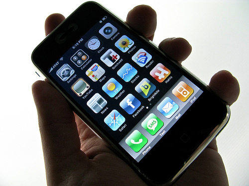
Did you know 75% of customers prefer a mobile-friendly site?* Does your business have one? If not—or if you’re not sure—today’s guest post from Todd Sieling of Denim & Steel can help you understand some of the aspects to consider when going mobile. *Source: Google, July 2012
Taking your website to mobile compatibility can be daunting. Mobile devices are continually changing, while people’s expectations for websites evolve as they get used to working with the web in more contexts.
That uncertainty pushes many into thinking that they need the most robust technology they can get. At Denim & Steel we know that the biggest size doesn’t fit all, so we start by setting technology decisions aside, and do some research instead.
We start by looking at analytics, the statistics about website visits that, among other things, tell us how many people look at a website with a mobile device, and the characteristics of those devices. That knowledge informs us about the device capabilities in play, and what pages people try to get to on those devices. But analytics are only half the story.
We also get insight into what people want from a website when they’re using a mobile device. Using surveys and personal interviews, we learn the places and situations people are in when they visit the site, and what they have in mind. This helps us understand what content is most important in mobile contexts, and the range of intentions we need to design for.
Next we look at the current state of the website to be updated. The reality is that some sites need only a few updates to account for most mobile devices and many situations, while others need an extensive overhaul that can deliver other benefits, but also requires much more effort and cost. This is also a good time to talk about the visual design of the current site, and whether there is room and desire to make some updates. If you’re happy with how the site looks, that look can usually be translated into a mobile design that lines up nicely. If things are feeling a bit stale, the mobile view makes a good space to try out some new ideas and eventually roll them back into the main site, so that your look is evolving and not undergoing a major renovation. Knowing how people are trying to use your site on mobile devices, and what they’re looking to accomplish, we can assess against the current technology and let clients know their range of options.
When its time to make changes, we often recommend working in sprints. Instead of embarking on a big, monolithic project, we look at what can be done in a shorter burst of time, say two weeks. We set goals we can meet in that time, and the constraints make priorities easier to decide and outs results within faster reach. Those results often go live at the end of the sprint, meaning customers start to see changes earlier. After the sprint, we review results and plan next steps, maybe with bigger goals, maybe smaller. This approach controls costs for clients, keeps priorities in view and results within a shorter reach of time. If we get to good enough, the client can park development until its time to make the next move.
Approaching mobile for us is different for every client, but has those three critical steps of research to understand the site and what people want from it, assessment of technology, and then working in bursts to deliver results incrementally so that risks are controlled and results happen quicker.
Guest Post by Todd Sieling of Denim & Steel. Denim & Steel provides invention for hire services that help people turn ideas into interesting and engaging products. From ideation and strategy through branding and interactive design all the way to coding and delivery, we find novel and trustworthy ways to put technology to work to make life better in sustainable ways. Learn more about Denim & Steel Services.
Photo Credit: sparktography via Compfight cc

